
Psychology Behind User Interface Design: A Journey Through Time, Tools, and Technology
Imagine trying to navigate around a busy city with no signs, directions, or popular landmarks to get to a popular restaurant where you have reservations.
You’d likely feel a mix of emotions ranging from frustration to anxiety, wondering if you’ll make it on time or even at all.
A poorly designed user interface (UI) can elicit the same feelings.
A website with confusing navigation and an unattractive color scheme can turn potential customers away, leaving a negative impression of the brand. Today’s user interfaces have come a long way from the slow, text-heavy pages of the early internet.
Modern designs are sleek and engaging, significantly impacting brand perception, sales, and the overall user experience. An effective UI guides visitors from initial interest to brand loyalty to end consumers, making each interaction count.
When a user arrives at a poorly designed site with a haphazard navigation structure and unwelcome color scheme it can cause them to leave your website. This results in the loss of a potential customer and creates a lasting negative brand perception.
User interfaces have evolved since the inception of the internet. Once text-based pages with slow page load times have vastly evolved to the sleek, engaging designs consumers are accustomed to today.
UI is paramount in brand perception, sales, and the overarching digital experience. A good UI can influence consumers to take digital action, guiding them through the journey of becoming aware of your business to becoming an evangelist.
Every click and scroll are meaningful. The more enjoyable and accessible your design is, the more likely a customer is to engage with your business.
But what makes a UI stand out? It extends beyond aesthetics and developing an understanding of your target audience.
In this article, we’ll break down the psychology behind user interface design and how to create exceptional experiences with website visitors. These insights will better inform marketers, developers, and SEOs on how to create a convert-worthy website design that motivates potential customers to act.
Before reading on, don’t forget to explore the numerous free SEO tools UNmiss has to offer, including tools that improve UI such as the Page Speed Checker tool and Screen Resolution Simulator.
The Evolution of UI Design

When diving into the fascinating history behind user interface design, it’s best to begin with its origins. The journey of UI began with a simplistic screen where users typed text commands to get their computers to perform a desired action.
The early days of computer technology, including UI, were meant for the technically adept rather than digital marketers, providing a difficult user experience for those who weren’t as tech-savvy. UI formally dates to the 1970s and has since come a long way, embarking from a tech-focused clientele to becoming user-friendly for most of the general population.
When graphical user interfaces (GUIs) were introduced, the UI landscape was forever changed. GUIs were a revolutionary and welcome change, replacing text-based commands with more user-friendly elements such as visual icons, menus, and windows.
This change enabled broader usage, ensuring broader reach and accessibility for users with varying technical expertise. While researchers at Xerox Parc were behind the first computer to feature GUI, Apple’s Macintosh was the first to bring GUIs to the mass market in 1984.
Revolutionary UI Advancements
UI has come a long way from its inception decades ago. Smartphones, tablets, and other devices completely revolutionized the UI experience. Apple’s iPhone, first introduced to the mass market in 2007, was perhaps one of the most notable UI advancements.
The iPhone marked a significant departure from flip phones and pagers, allowing users to perform engaging tasks such as tapping, swiping, and scrolling. Long gone were the days of manually typing on a raised keyboard and clunky designs.
The evolution of UI design is marked by significant advancements, like the iPhone, and even newer technology like smart devices. The UI landscape has fundamentally changed to improve user experience for the better and customers are becoming accustomed to high-quality, functional designs across every device they use.
The Psychology Behind User Interface Design
Psychology and honing in on human behavior are essential for effective UI design. One critical aspect to consider is the amount of mental effort an individual has to exert to use a website. This is known as cognitive load.
A high cognitive load will likely result in a negative customer experience. For example, if a user isn’t able to quickly identify how to navigate to the desired information, they’ll likely feel frustration and resentment. Research has shown that a poorly designed website with irrelevant information can cause 38% of users to abandon it.
On the other hand, a low cognitive load allows users to find what they’re looking for with ease, creating a positive customer experience and likely eliciting emotions such as happiness and contentment.
Cognitive load can be broken down into three distinct types: extraneous, intrinsic, and germane.
- Extraneous: How the information is presented
- Intrinsic: How complex the information is
- Germane: The amount of effort it takes to understand the information
A good UI design will reduce extraneous load and improve germane load.
Strategies to Improve Cognitive Load Through UI
As aforementioned, it’s crucial to reduce cognitive load to make every customer interaction engaging and free of stress.
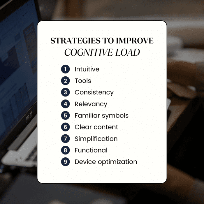
There are several approaches to accomplish this, including:
- Make Sure It’s Intuitive: Simplicity is the key. Ensure your design is clutter-free and user-friendly. Eliminate distractions that could impede user experience.
- Use Tools: Tools such as UNmiss’s website audit tool can help identify UI issues such as missing page titles, descriptions, H1 tags, as well as content or technical issues.
- Keep it Consistent: Ensure your website design is consistent, simple, and aligns with overall branding. Use your brand’s colors, fonts, and logos everywhere. Use similar layouts for landing pages so they don’t look too diverse from the rest of your website.
- Highlight Pertinent Information: Differentiate important information using headings and subheadings. Group relevant information beneath these headings to ensure a smooth flow of information. Users should be able to scroll through your website and be met with a logical flow of information.
- Use Familiar Symbols: Users have become accustomed to seeing certain symbols and interpreting their meaning such as an hourglass for loading, arrows for scrolling up or down, a trash can for removing items, or a magnifying glass to search for information.
- Present Content Clearly: Organize your content in a way that is easy to read such as breaking up information into short paragraphs (4-5 lines maximum), using bullet points, or leveraging numbers to share a logical sequence of steps.
- Simplify Complex Information: Write in a way that reaches your target audience. If sharing complicated information, break it down into simple terms to better reach and engage your readers.
- Offer Different Content Formats: Some readers prefer to consume content in a visual format. Incorporate a mix of written and visual content to maximize your reach and retention. Create short videos to distill long-form content down into 60 seconds.
- Optimize for Diverse Devices: Imagine expecting a website to look the same on your mobile phone only to be met with a UI that doesn’t function properly. Your website should look and function the same across all popular devices such as desktop computers, mobile phones, and tablets.
- Improve Search Functionality: We’ve all navigated websites where the search feature returns subpar results. Ensure your search functionality is high-performing and delivers relevant results.
- Streamline Checkout Process: The checkout process should be straightforward, easy to use, and take only a few steps to purchase. Implement autofill functionality or enable users to sign in with their social media or email accounts to reduce the amount of information they need to type.
The Art of Visual Design in UI
Branding is one of the most essential aspects of marketing. Good branding sets your brand apart from the competition; excellent branding makes your brand recognizable to the masses.
Think of Nike’s swoosh or Target’s bright red circle. Any time a customer encounters these logomarks they automatically associate them with the overarching brand.
![]()
Target logo
While these are larger brands, the same can be accomplished with small and mid-size organizations with the right branding, art, and color schemes.
Aesthetics play a crucial role in UI design. The more visually appealing your website is the more likely customers will be to remember it and want to return. Research shows web design influences 94% of all first impressions.
Knowing how imperative it is to get UI design correct, it’s important to consider what contributes to a visually appealing design.
Color Scheme
A good color palette can capture attention, effectively convey information, and evoke positive emotions that drive action. Color is a powerful tool and understanding the right colors to choose requires research.
For example, red often represents love and excitement. Blue can elicit feelings of calmness, peace, and trust. Purple exudes feelings of imagination, mystery, and creativity.
Brands typically use multiple colors, which is why it’s important to consider how the colors will interact and what consumers will feel when they see them together.
Some colors may also work better for some industries rather than others. Technology brands, for example, typically choose more sleek and straightforward colors like black and white. Conversely, many healthcare brands tend to stick with blue hues to promote safety and security.

BlueCross BlueShield website example with a predominantly blue color palette
Fonts
Fonts are another integral component of website UI. A good font choice can influence readership and elicit positive emotions.
When selecting the right font or font family for your business, it’s important to consider a font that’s legible and easy to read. It’s also important to consider how the font will appear in larger and smaller sizes, such as for headings versus body content or on mobile devices.
Sans-serif fonts are popular when the goal is to create a modern and aesthetically pleasing website. Conversely, serif fonts are a good choice for print as they appear more traditional and authoritative.
Fonts can influence human behavior and emotions. For example, a bold font can convey strength and dominance, encouraging the user to focus their attention on the bold font before continuing to read the rest of the copy.
An italicized font typically conveys that the text is a title or can also be used to emphasize a phrase.
Website UI example with clear and easy-to-read fonts
Tools and Technologies Shaping Modern UI Design
Tools are indispensable for creating modern and sophisticated UI designs. A few of the most popular UI tools include Adobe XD, Figma, and Sketch.
Photo courtesy of Sketch
These tools help teams, such as design and marketing, collaborate in one environment. Design teams can present marketing with ideas, concepts, and designs and capture their feedback in a centralized location. They offer simple UI to promote seamless collaboration and quick feedback to move projects along quickly.

Figma UI example
Each tool has its inherent strengths and weaknesses. For example, Adobe XD is great for users who leverage Adobe’s expansive suite of products as it integrates seamlessly into this tech stack. Figma’s greatest strength is its ease of use, collaborative environment, and ease of accessibility as users can access it via a web browser.
Tools help streamline the UI process, from design conception to implementation enabling multiple teams to connect efficiently from product marketers to developers. Interconnectivity enables businesses to accomplish their goals, align teams, and improve outcomes.
Prototyping and Testing
Prototyping is the backbone of UI, allowing designers to present comprehensive mockups for feedback to drive forward the final design. Once the design has been initially built out, designers can collect feedback and identify potential issues before launch.
Using the previously mentioned tools, designers can mockup realistic prototypes allowing teams with a stake in the project to get a transparent view of how the live page will work.
Usability testing is another important endeavor for designers to gather feedback that will inform the final product. Through usability testing, designers can see how the average consumer will engage with the design or even employ A/B testing to see how two different variations of design perform.

Photo courtesy of Figma, device usability testing example
Eye-tracking is another less common usability test that follows what elements capture a user’s attention the most.
The insights obtained from prototyping and testing provide tangible results for where issues lie, what can be improved, and whether the UI will be successful in helping marketing, creative, and other stakeholders accomplish their goals.

Photo courtesy of Figma
Key Points
User Interface design impacts digital marketers in numerous ways. UI serves as the first impression a customer has of your business. It determines whether a potential customer will turn into a purchasing customer.
It directly impacts myriad marketing metrics such as conversion rates, time spent on page, bounce rate, and more. A bad user interface translates to poor results, loss of customers, and negative brand perception.
UI design has come a long way since the 1970s, offering sleeker and more intuitive designs that command attention and deliver noticeable results. Marketers must stay on top of what motivates consumers to act, diving into the psychology behind decision-making.
A mix of human psychology and exceptional design will help guide users on a smoother path to purchase, ensuring their digital journey with your business is enjoyable.
For digital marketers and SEOs, UI simply can’t be ignored, and these insights provide more than just food for thought but rather tangible strategies for delivering meaningful experiences. Continue to iterate, redesign, and improve upon existing designs to stand out from the competition and motivate users to take repeated action.
We mentioned many different tools in this article, but did you know UNmiss offers dozens of free tools to improve user experiences? Check out our full library of SEO and user experience tools here.